
I’m sure most IT people were aware that Office 2016 shipped last week, but publically it didn’t arrive in much of a blaze of publicity. Certainly there was enough coverage in the computer press and online (well, most online I guess) but it didn’t garner the amount of attention seen with Windows 10 or anything that Apple release.
Updates to Office are an interesting beast. When I started at Microsoft (June 2011) Office 2010 was the current version. It looked very different to 2007, and there were many conversations with customers about the visual differences and the inevitable concern about training. My personal opinion is that some companies don’t give their users enough credit for their ability to adopt a new version, and in many cases home users are a version ahead of their work installation. Companies could be worrying about their employees’ ability to grasp something they’re already using.
Then came 2013, and that looked a bit different to 2010 – although if you looked past the cosmetics almost all of the commands, right-clicks and tabs were the same. But again, companies were concerned about the transition. Yes, I do know that developers write add-ins that may not work on newer versions, and that can be a deployment blocker.

As well as the visual changes, there were other things going on. Office 2013 was available as a suite that you could install via traditional method (e.g. from a CD, which seems positively Iron Age these days), but it could also be installed from the cloud for Office 365 users. Click-to-run, streaming downloads on-demand, and silent updates. It also integrated with Office 365 and OneDrive for Business (SkyDrive Pro as it was in 2013). Office 2013 allowed you to associate an account with it – it knew who you were, which files you’d been working on, even which page you were last on, and these attributes ‘roamed’ with you if you switched devices. It was cloud-ready.
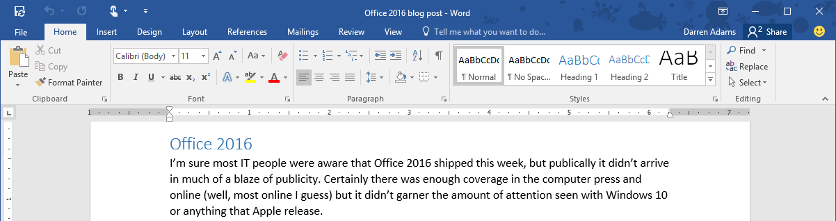 So let’s talk about Office 2016. First, here’s the big shocker – when you first install it, it looks almost identical to Office 2013. There are a couple of things on the interface that give away its 2016-ness, but you have to look closely. The only arguments about training, if you’re stepping from 2013 to 2016, should be about the new features (which we’ll discuss another time). Now, this is a bit of a shocker, because if you’ve ever paid for an upgrade from one version to another, you’ll want to feel like you’re getting a new product, and generally that’s through it looking a bit different. The same was true of dear old Lotus Notes, and Paint Shop Pro, and almost everything. The good news is that if you want Office 2016 to look like it’s had a visual update, go into the options and change the Office theme to ‘Colorful’. Apologies for that spelling of ‘colourful’, the Product Management team are based in the US of A.
The colourful theme isn’t the only new thing in Office 2016, but we’ll look at some of the new features in subsequent blog posts (coming soon).