My previous blog post about Visio focused on integration with SharePoint, but now I’m going to take a look at using Visio for simulating and optimising business processes. Just about everyone knows that Visio allows you to map out workflow and business processes… and it’s also possible to publish workflow processes into a SharePoint site. But how could you work out how many people it takes to complete a process on an on-going basis, how much the process costs, where the bottle-necks may occur, and how you could fix the issues? Visio 2010 Premium edition and Global 360’s analystView solution provides the answer.
 One of Visio 2010’s many templates contains shapes and rules for Business Process Model and Notation (BPMN). If you’re interested in a detailed overview, visit the Wikipedia page. The shapes that are contained within the BPMN template adhere to strict rules and are fully configurable – there are different types of tasks and gateways (that’s the BPMN name for ‘decisions’). This is best illustrated with a simple example. Click on the image to see the full process.
The example process starts with faulty devices being received by the repair department. The device is assessed and passed to an expert engineer if it’s a major fault or a routine repair engineer if it’s a minor fault. After the repair is carried out, the device is tested, and if it passes it’s returned to the owner. If the device repair doesn’t pass the test, it loops back to an expert engineer to have another go.
Now, this works fine as a basic concept for a repair process, but to simulate it there needs to be a lot of details behind the scenes. This is where Global 360’s analystView comes into play. This Visio add-in allows us to configure all of the necessary metrics:
- Rate of devices received (arrivals) – in my example one device every two hours
- How long it takes to assess the problem (thirty minutes)
- How many will be routine repairs and how many will be major – the two decision points can be weighted, and 70% will be routine
- How long it takes to do a routine repair (two hours) and a major repair (four hours)
- How long it takes to perform a test (one hour)
- How many devices will pass the test – based on weighting 90% will pass
- How long it takes to dispatch the device (fifteen minutes)
What’s missing from this? People. analystView allows us to define roles, assign the people to activities and shifts, declare a cost per hour, and define their effectiveness (e.g. expert engineer 1 may be able to complete the repair in three hours rather than four). So in this example we have two assessors, two expert engineers, two routine engineers, one tester and one dispatcher. Given the rate of arrival, the number of staff on each task, the duration of tasks and the relative weightings, what will happen over a twenty working-day period?
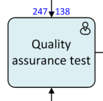
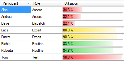
 When a simulation is kicked into action analystView will start to generate lots of data. Probably the most important is the number of devices which enter a specific part of the process and how many are completed. In this example you would be able to see after just a couple of working days that the testing activity is under-staffed and becomes a bottle-neck, and by the end of the twenty days has a backlog of over one hundred devices (see image on the right). Major repairs lag a bit, but not too badly. Problem assessment experiences 100% completion, and with activities such as this it’s important to look at the utilisation – both assessors have a utilisation rate of around 33%. Meanwhile the tester is maxed out at 98.8%. See below for the complete utilisation overview.

Based on this information, there’s one obvious thing we could do to solve the bottleneck… we can take Andrea from the assessment team and get her to work on testing in the afternoon (analystView allows us to define and assign people to shifts). Having done this, we run the simulation again. This time, the testing activity is able to keep up with the load (there’s a backlog of twelve, which isn’t too bad), and the assessing activity doesn’t suffer and is able to manage the workload. The utilisation of the participants starts to look much more balanced (although Dave has lots of time to relax with a cup of tea and a newspaper, and still manages to get all of the devices shipped). Overall the completion rate is 92.1% compared to 48.7% on the first run.
The utilisation chart above is one of many data sets created, so there’s enough information to work out where problems are occurring. Given the level of controls within analystView there’s lots of scope for tweaking and playing ‘what-if’. However, if you want to take the lazy and less fun route, you can just press the ‘Optimize’ button and let analystView add a quick solution or guide you through an optimization wizard.
You can find more information about analystView at Global 360’s site (by the way, they’re now part of OpenText) and download a trial version.

Hi Darren,
I have not seen you this interested in technology since … ah heck, never! Sounds fantastic. I guess it is time for me to drop Ubuntu and get back to the real world. Seems like you are having fun and I kinda envy you. Ah well, back to symphony for me.
Like the idea of this and this line of blog posts from you, granted only because I love Visio.
Not trying to be funny, but if one has a spreadsheet program, one could do this too. Pivot Tables et al may be above the average spreadsheet user but still why make something simple more difficult?
Plus where do the details of this reside? In Visio? So if you wanted to share the analystview or outcomes/tests, how would you do it with non-Visio users?
Keith, I don’t reckon you could do this with a spreadsheet. Maybe it’s not apparent through reading this post, but even this ‘simple’ process becomes quite complex when look at the time that people spend waiting for the person before them to finish the job, and the knock-on effect of devices which don’t pass the test looping back for another attempt. Also, bear in mind that I’ve over simplified this and assumed that one activity could start as soon as the previous one ends – the reality is that there’s probably a lag (15 minutes, maybe 30, or an hour) between an assessor concluding their assessment and the device ending up on the workbench of an engineer. analystView provides for pre and post-processing time.
I’ve also over-simplified the rate of work coming in as a flat ‘one every two hours’. In the real world it may be more random, and things may come in in batches (so the assessors go from none in the queue to eight waiting). Again analystView has advanced functions (that I haven’t yet touched) to simulate various patterns.
The actual metrics of the process are stored in the Visio file… mostly in shape data. To share the outcomes, there’s a report button, three different types of report, and they can be saved as complete HTML pages.
Interdependancy and Random behaviour that cannot be mimiced by Excel sheets can be mimiced by Simulation Software that sits on Visio. One such software is Process Simulator from ProModel Corporation(promodel.com). This is an excellent tool to simulate and check processes mapped in Visio and look at Different Scenarios