Office 2013 has the ability to provide in-application apps to users, and Excel is the most bountiful place to find and use these handy additions. Here’s a pick of some of the best.
 Random Generator by AbleBits – as the name suggests, this app inserts random numbers, which is really useful when creating some fake data for a demo (particularly if it’s a business intelligence demo which often requires a LOT of data). But I hear you ask, isn’t it easier just to use the =RAND or =RANDBETWEEN functions? No, this app makes it easier, because you can just highlight the range, set the numeric or date limits, specify the type of fill (integers, real numbers, dates and Boolean) and generate the values.
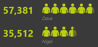
 Next let’s look at some visual tools, and start with People Graph. This is a very infographic-like way of presenting a simple range of data – rather than traditional bars and lines, with People Graph you can use small images to represent the values. The default image is a small person (hence the app’s name) but you can choose from an number of images (four styles of person, hearts, stars, cartons, clocks, a dolphin, and many more) – and, as illustrated here in the large image (click on the small one) money bags. There’s also a number of themes which provide three different layouts and a lot of colour and design choices.
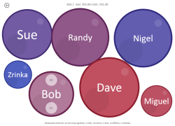
 Another interesting way of displaying your data is with Bubbles, by Rolando Jimenez. It has two modes – the first is a simple concept… the larger the value, the larger the bubble. You can set a colour range and assign colours to the bubbles, get them to bounce around into a random position, and drag them to (roughly) where you want them. The second mode is ‘lookup’ which allows you to look up values from a row in a corresponding table and add them to the surface of the bubble.
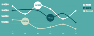
 And finally, Modern Trend. Back to the infographic styling, this is an app which creates tasty line charts in six attractive colour themes. The small image here shows one of those themes, and the large image (click on the small one) shows the dark theme. The chart has three text elements to edit, again giving it that infographic feel. Clicking on any of the data point displays a bubble with the underlying data value, and you can click on the boxes in the legend to turn the display of a series on or off.
That’s just a few of the apps for Excel, and there’s many more to explore in the store (hey, that’s nearly poetry).
Thank you to my colleague Martin Wilkins for introducing me to Bubbles.

Radial bar chart is another good one.
Thanks Dan… yes, I have that one, and a few more, I just picked my four favourites.